There is a discipline to physical design that digital design sometimes forgets.
When you are designing a sign that will be fabricated in Corten steel and mounted to a stone base at the entrance of a hotel, there is no iteration after installation. The material choices are permanent. The scale is fixed. The light that strikes the letters at 7am on a Tuesday in January is the light you designed for, whether you knew it or not. You cannot push a button and change it.
That constraint, the irreversibility of material decisions, produces a particular kind of rigor. It forces designers to think harder before committing. To ask more questions. To understand context more deeply. To make choices that will hold up not just on a screen but in the world, over time, in weather, in wear, in the accumulated encounters of thousands of people who will never know your name.
We have found, across years of working on both physical and digital projects, that this rigor is one of the most valuable things physical design can teach.
What Materiality Demands
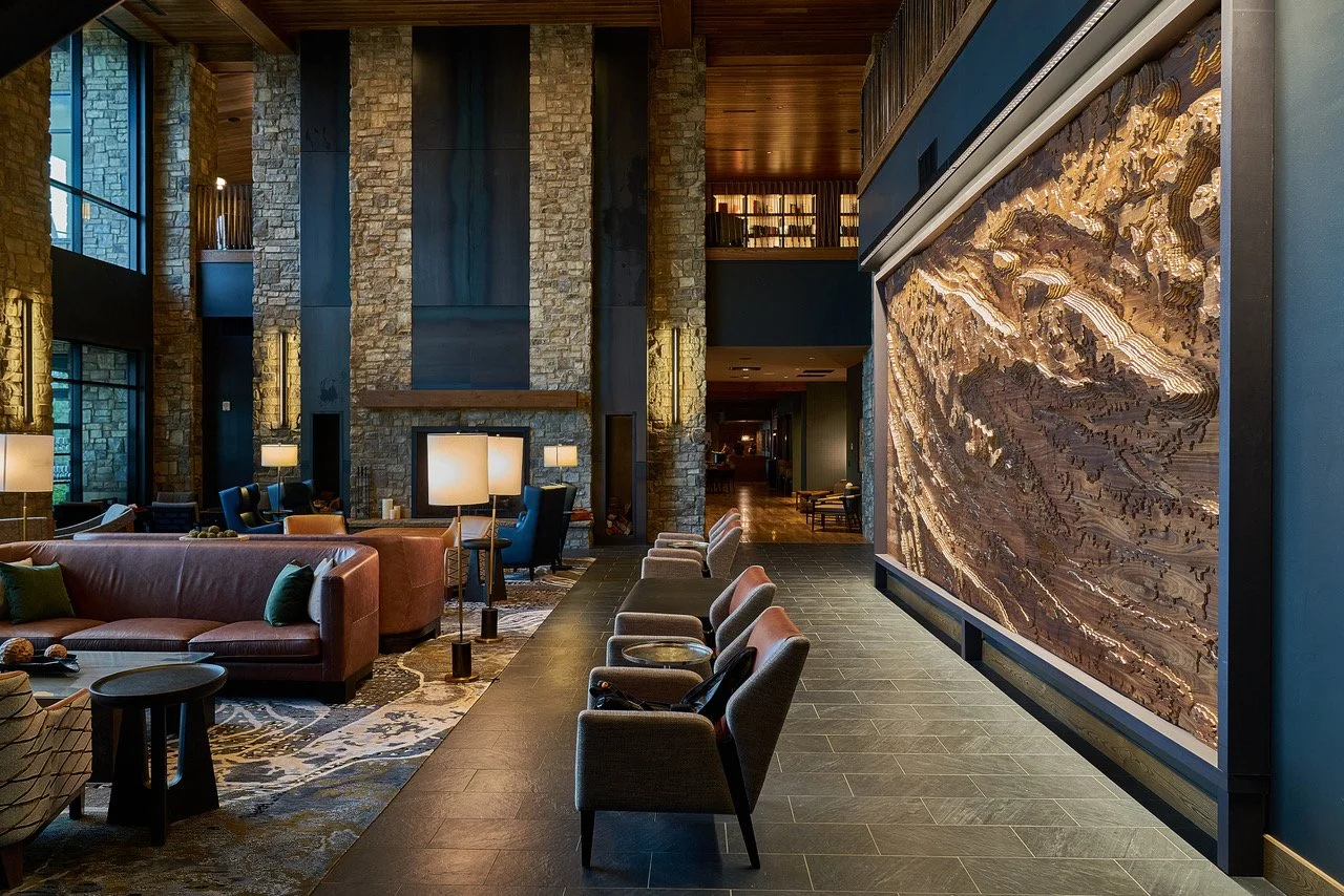
When ESQUE developed the signage system for Cloudland, the specifications went beyond aesthetics. The monumental entrance sign required a locally sourced stone base, not just for visual reasons, but because the stone carried the geological identity of the place. The Corten steel lightbox, fifteen feet long, two-sided, with letters offset from the substrate and backlit by opaque acrylic, was designed to change as it aged. Corten oxidizes. Its surface shifts over years from bright orange to a deep, settled rust that looks like something the mountain grew rather than something a fabricator installed.
That decision, to choose a material that would evolve, is a digital design concept. It is just harder to implement in steel. Every room key card, door hanger, and wayfinding sign in the system had to cohere with that entrance sign, which meant every piece of the identity system was designed with the weight and permanence of the physical object in mind.
The result is a brand system that does not feel like it was designed. It feels like it belongs.
When Scale Becomes the Medium
At McLemore, the brand mark lives at wildly different scales simultaneously. On a tee marker, a cast Corten steel and aluminum form pressed into a fairway, it reads at roughly six inches. On the entrance to the clubhouse, it reads at several feet. On a bag tag, smaller still. In print advertising placed in golf and lifestyle publications, it appears at standard column widths. On a 584-page website, it scales across device sizes from a desktop monitor to a phone held vertically.
Each of those environments is a different medium. Each makes different demands. A mark that works at six inches might dissolve at the wrong scale. A type treatment that reads beautifully in a magazine might lose its rhythm on a small screen.
The discipline of designing the physical system first, of asking "how does this hold up in cast aluminum on a fairway in direct sun?", sharpens the judgment you bring to every subsequent decision, including the digital ones. If the mark survives Corten steel and morning light, it can survive a browser.
Flatrock Motorclub: The Challenge of Communicating a Feeling
Some brand challenges are about communicating what a place is. Others are about communicating what a place feels like. The latter is harder, and it is where the gap between physical and digital design is most revealing.
Flatrock Motorclub is a private members-only resort on 900 acres atop Tennessee's Cumberland Plateau, built around a 3.5-mile FIA Grade 2 racetrack designed by Tilke, the firm responsible for many of Formula 1's most demanding circuits. The physical experience of driving that track is visceral, kinetic, deeply personal. It is not something a photograph captures. It barely survives video.
The question was: how do you translate that onto a screen in a way that makes someone want to be there?
The answer required weeks of planning, a full production crew, and a camera strategy built around a counterintuitive insight: the most compelling footage of a racing experience is not the track. It is the driver. By focusing on the person behind the wheel, the concentration, the physical engagement, the particular quality of someone doing something they love at the limit of their skill, and keeping the track itself largely out of frame, the content created a sense of wonder. Viewers did not see the circuit. They felt the desire to be the member.
That approach, show the feeling, not the feature, is as true in web design as it is in video production. The website built from that content did not describe Flatrock Motorclub. It made you want to go.
The Translation
Physical and digital design are not different disciplines. They are the same discipline applied to different surfaces. The questions are identical: What is the truest thing about this experience? How do we make that true thing perceptible to someone who is not here yet? What will this look like in five years?
The physical world demands those questions be answered before the fabricator is called. Digital design has the luxury, and the risk, of iteration. The best digital work borrows the rigor of the physical: it designs as if the decisions are permanent, because for the guest or customer encountering it for the first time, they are.
ESQUE is a strategy, branding, and design studio. We work with clients whose ideas deserve to be experienced, not just seen. Get in touch.