The logo is not the brand.
This is one of those things that sounds obvious until you watch a well-designed mark get applied to a website that does not match it, apparel that undermines it, signage that contradicts it, and a social media feed that ignores it entirely. At that point the logo is not the brand. It is just a shape on a letterhead.
A brand is the totality of every encounter a customer has with a business. It is the entrance sign and the room key card and the font on the menu and the way the staff are dressed and the quality of the paper in the brochure and the feeling of the website and the voice of the social media posts. Each of those encounters either reinforces the same story or introduces noise. The job of a brand system is to make sure every encounter, from the grandest to the most incidental, is telling the same story.
What a System Actually Is
A brand system is not a style guide. Style guides describe rules. Brand systems create possibility.
The distinction matters because a style guide assumes you can anticipate every surface the brand will appear on. You cannot. Brands migrate into contexts that did not exist when they were designed: new product lines, new digital platforms, new physical environments, partnerships, events. A brand system needs to be flexible enough to move into those contexts without losing coherence.
What makes that possible is not more rules. It is a strong enough core, a mark, a palette, a typeface, a voice, that any designer, fabricator, or partner who understands it can make appropriate decisions in new situations without having to call and ask.
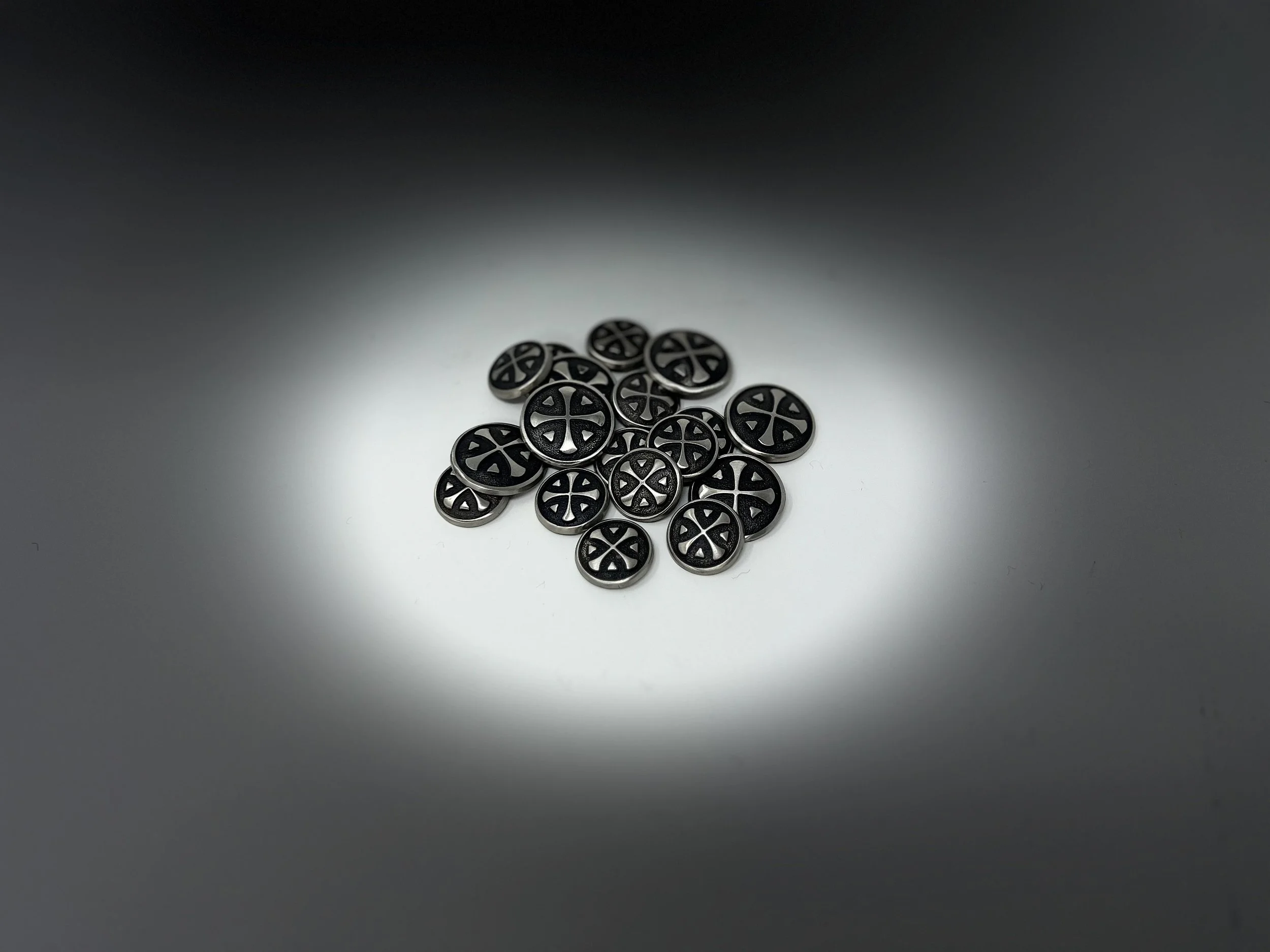
McLemore: A System Built for 584 Pages
The McLemore brand system is one of the most thoroughly deployed identity systems we have worked on. The mark, the overlaid Celtic cross and Cherokee Dogwood, appears across so many surfaces and at such varied scales that its consistency has become, over time, the defining characteristic of the resort's identity.
That consistency was not accidental. It required designing a system that could translate across material, scale, and context without losing its essential character.
On the physical side: Corten steel tee markers pressed into the fairway. Cast aluminum bag tags handed to members each season. Custom hand-cast buttons for the member sport coat, details so specific they suggest the resort cares about the things no guest will ever consciously notice, but that contribute to an overall impression of extraordinary attention. Monument signage. Gallery walls. Architectural elements throughout the clubhouse. A fire station.
On the print side: advertisements placed in golf, home, and lifestyle publications. Full-spread treatments that communicate in the language of magazines read by people for whom quality is assumed rather than surprising.
On the digital side: a 584-page website designed not as a marketing brochure but as a comprehensive experience, one that answers every question a prospective member or guest might have while maintaining the visual and tonal standards of the physical environment.
Across all of it, the mark, the palette, and the typography are consistent. A guest who encounters the bag tag in the car park and the spread in a golf magazine and the entrance to the clubhouse and the website is having a single coherent experience that has been distributed across many surfaces. They may not articulate it that way. But they feel it.
Flatrock Motorclub: System as Growth Engine
Brand systems also have to do something more prosaic: they have to work as business tools.
When ESQUE began working with Flatrock Motorclub, the resort had a track and a vision and a significant real estate development underway. What it did not yet have was a brand presence commensurate with its ambitions, or the content and distribution system needed to communicate those ambitions to the right audience.
The system we built was comprehensive by design. An identity refresh that added a sense of compression to the existing mark, tighter, more authoritative. A video and photography library built from weeks of on-site production, designed specifically to capture the visceral experience of the track and the luxury of the amenities. A website rebuilt to present the full offering: the track, membership opportunities, real estate, fine dining, spa, and future development, all within a coherent visual environment.
Then distribution: a daily social media program to grow awareness. Print advertising in publications whose readers are the exact audience: duPont Registry, Robb Report, Porsche Christophorus. Look books for each of five real estate offerings. A quarterly newsletter designed and produced to read like a magazine. Luxury apparel developed in partnership with lululemon, Peter Millar, and Greyson.
The results: website traffic up over 1,000%. Social media following up over 400%. Those numbers do not happen because a logo is well-designed. They happen because a system was built, one where every element, from a post on social media to an ad in a Porsche publication, is working in the same direction.
The Pocket Café: System at a Different Scale
Brand systems are not only for large, complex clients. The principles scale down just as well, and the discipline of building a true system, rather than just a logo, is just as valuable for a small café as for a 900-acre private resort.
The Pocket Café at McLemore is named for the Pocket, a protected wilderness area at the base of Pigeon Mountain, home to one of the most botanically diverse concentrations of flora in the United States. The identity system we designed is built entirely around that botanical heritage: illustrated logo versions, a color palette drawn from the wildflowers and greenery of the preserve, typography that carries the same quiet naturalism.
And then: a former Senior Photo Editor for National Geographic was commissioned to shoot portraits of the Pocket's actual flora. These photographs were printed, framed, and hung on the café walls in a gallery setting. The botanical identity system did not stop at the logo or the coffee cup sleeve. It extended into the physical environment, turning the walls of a café into a portrait of the landscape that gave the café its name.
That is what a system does. It creates coherence between the name and the mark and the color and the type and the photograph on the wall and the napkin on the table. None of those elements is the brand. All of them together are.
ESQUE is a strategy, branding, and design studio. We work with clients whose ideas deserve to be experienced, not just seen. Get in touch.